
After two years the post I had been meaning to write is finally here! I hope you enjoy reading about how I have created my RSN diploma stumpwork project and what the assessors thought of it.
Design
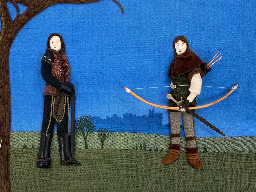
From the moment I learned about the stumpwork module I knew which design I wanted to stitch. I had to do a Robin Hood and a Sir Guy of Gisborne. Not just any Robin Hood and Sir Guy but modelled after the characters from two TV series I have enjoyed watching.
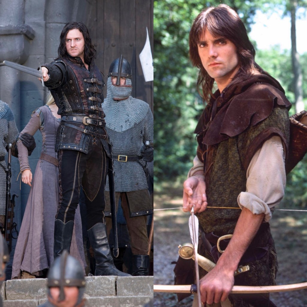
Robin Hood had to look like the title character from the STV Robin of Sherwood series from the 1980s as portrayed by Michael Praed and Sir Guy of Gisborne obviously had to be modelled after the character as portrayed by Richard Armitage in series 3 of the BBC Robin Hood series from the 2000s.
In order to complete the module you have to stitch a stumpwork figurine of about 12 cm tall, with a face and hands. So suggesting doing two figures got me lots of warnings from the tutors as doing two of something means there is more chance of losing marks as both figures will be assessed. However, I was very determined and this had to be the design.
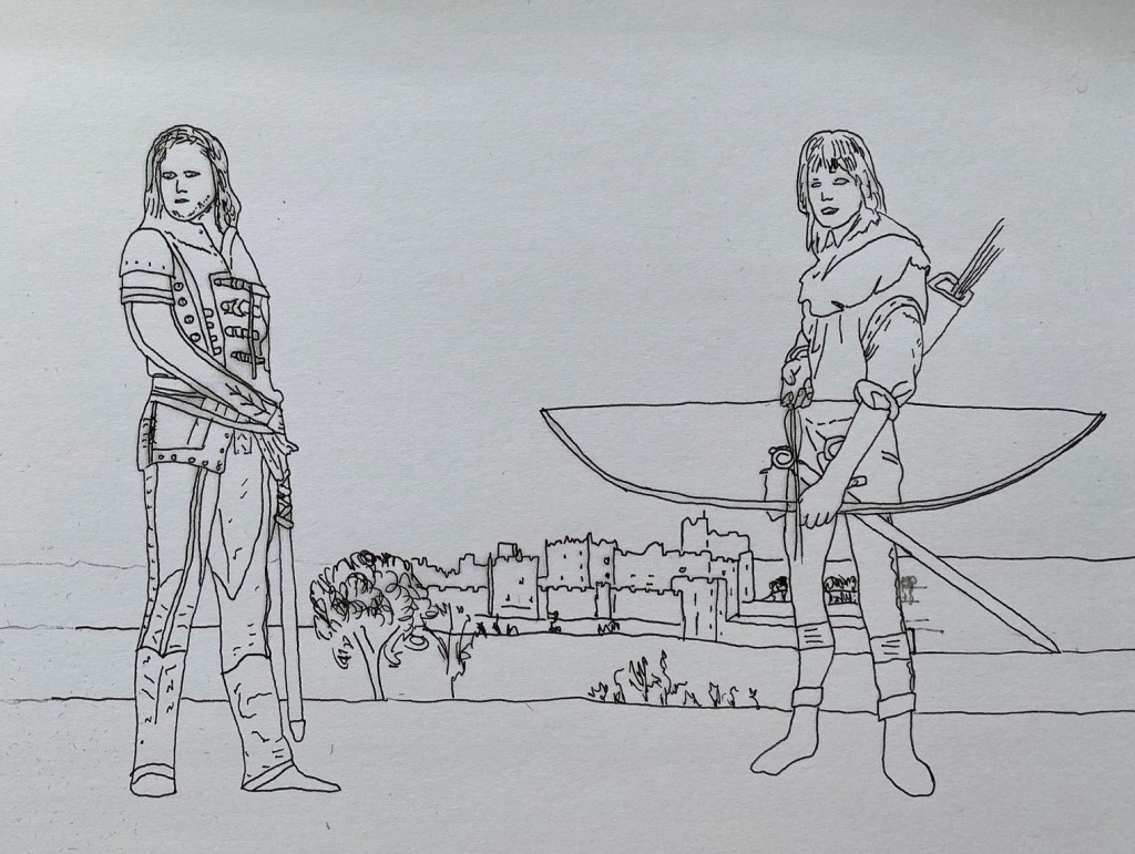
At the start I spend a lot of time choosing suitable pictures of the characters which I could recreate in stitch and which would look good together in a design. This was quite difficult as many pictures don’t include a head to toe figure. With a little artistic licence I managed to create two figures I was happy with.
Background
The next challenge was the background, as it had to be, at least partly, stitched before I could start work on any of the figures. I had found a picture of Alnwick castle, which they had used in the Robin of Sherwood castle to represent Nottingham Castle, at dusk. I wanted to create this vivid blue gradient on my background.

I bought Wedgwood blue silk from the Silk Route and wanted to paint on the gradient. I tried watercolour paints at first but I didn’t like the effect. When the paint has dried it sits on top of the fabric and it just looked really messy. From tips by Caroline Zoob I purchased different colours of Javana silk paints from Kleur & Zijde.
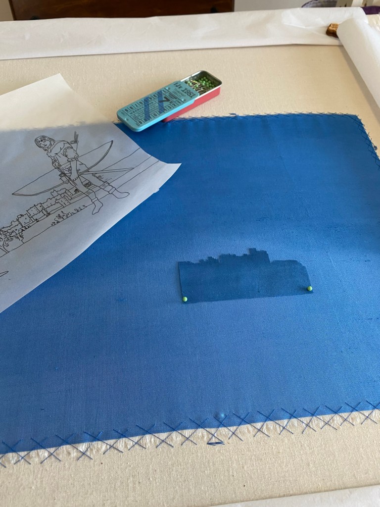
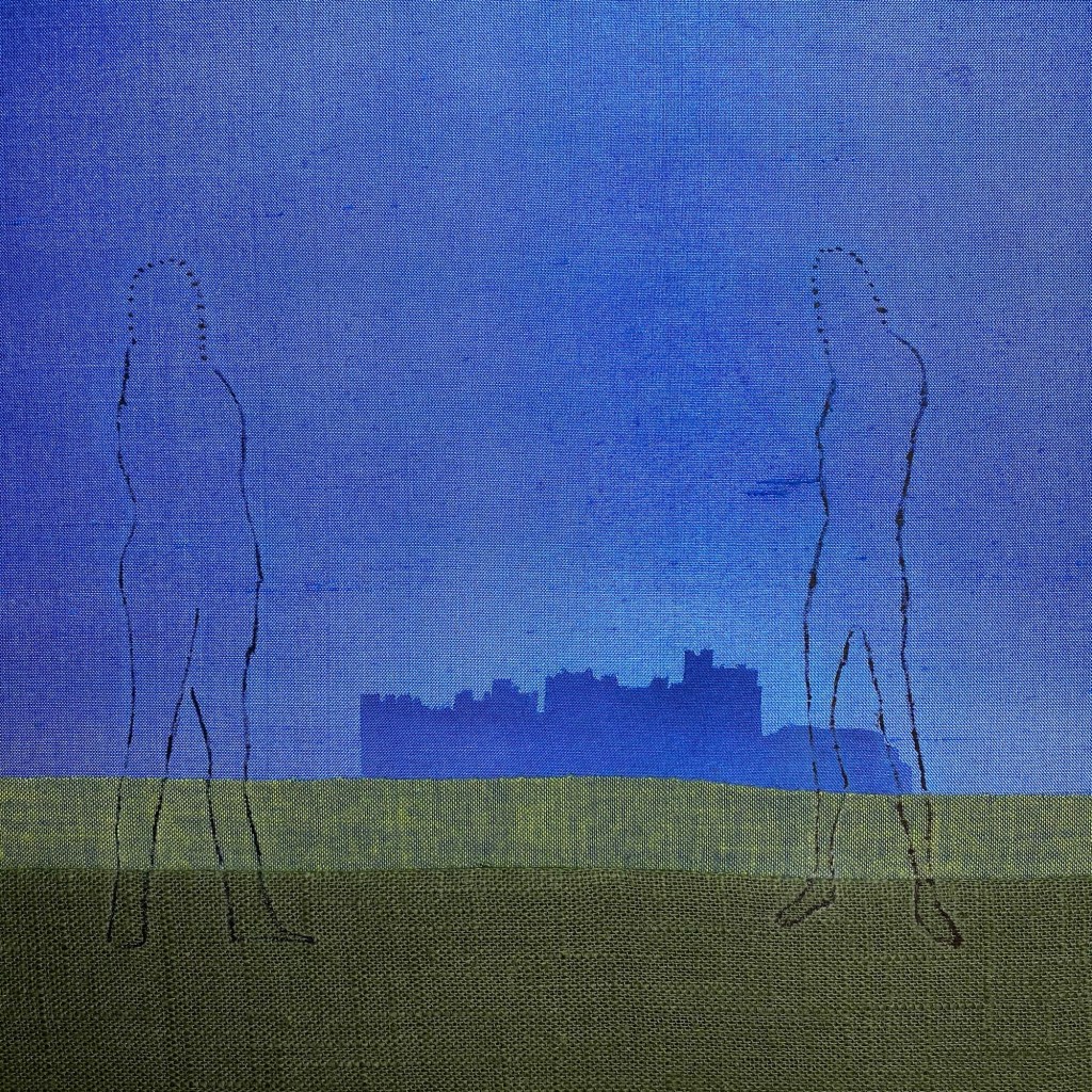
Working with silk paints still is as challenge, as you quickly get watermarks if the paint doesn’t dry evenly. So it took a few goes to get the desired effect. I also painted a separate piece of silk slightly darker for the castle. I ironed some bondaweb on the back and drew on the silhouette. I cut it out and ironed it onto the sky. Next I added some padding for the hills and add a cotton fabric to cover them.
All other background details I decided to leave until the figures had been completed. As the project is about the figures I didn’t want the background to overpower the figures so I thought it best to leave any details till last.
The figures
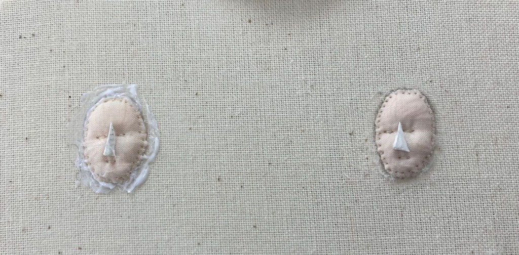
The next step was to prick and pounce my two figures on the background. I also photocopied the line drawings onto some OHP (over head projector) film I still had lying around. These helped me a lot in getting the placement of all of the details of the figures correct and in the right position. It was a trick I had invented while I was doing my applique and it came in very useful again.
After that I could start to ‘built’ my figures. The both have felt padding as its base. Sir Guy even has some extra trapunto padding of toy stuffing from the back to give him a bit more of a masculine chest.
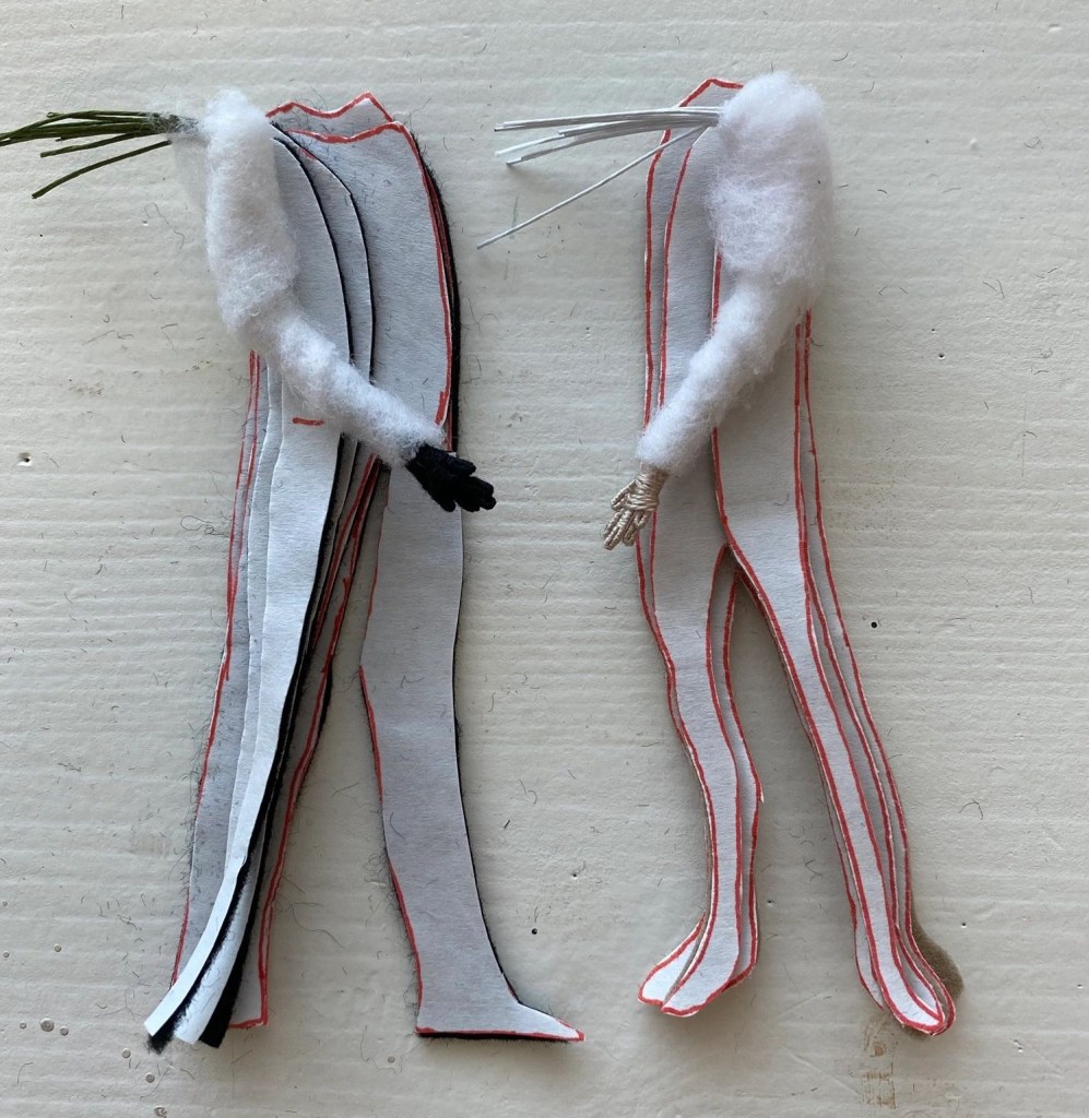
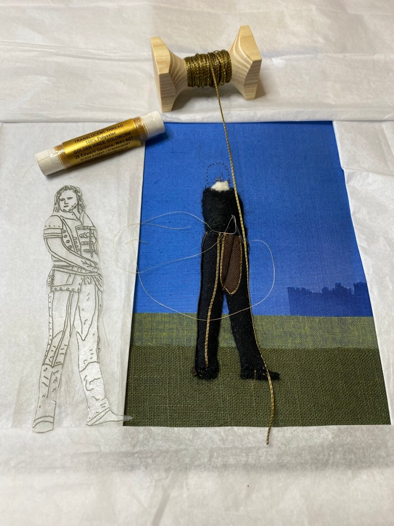
For the fabrics I mostly used little sample pieces I got from the Cloth house. These are nice cottons and linens giving the look of clothes worn in the medieval period. I used fettuccine ribbon from Jenny Adin Christie on the side of Sir Guy’s trousers (and also on the edge of his tunic). The gold ‘piping’ is made using tarnished gold jap. Robin’s trousers has velvet ribbon from Rainbow Gallery on the side.
Both Robin and Sir Guy have a needle lace tunic. They are both worked in corded Brussels. Sir Guy’s using Gumnut Yarn’s stars in the colours 869 and 989, and Robin’s using Devere Yarns worsted wool in laurel (2861) and cigar (2864).
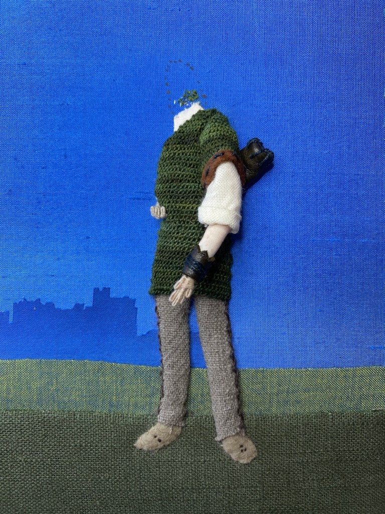
I found it quite difficult to get the details right on Sir Guy’s tunic. As you can see from the pictures. In reality there are a lot of elements to it, but due to size constraints they are impossible to recreate in stitch. One of my tutors came up with the perfect closure for the tunic, made from very fine silk gimp from Jenny Adin Christie, and tiny brass sequins from Golden Hinde.

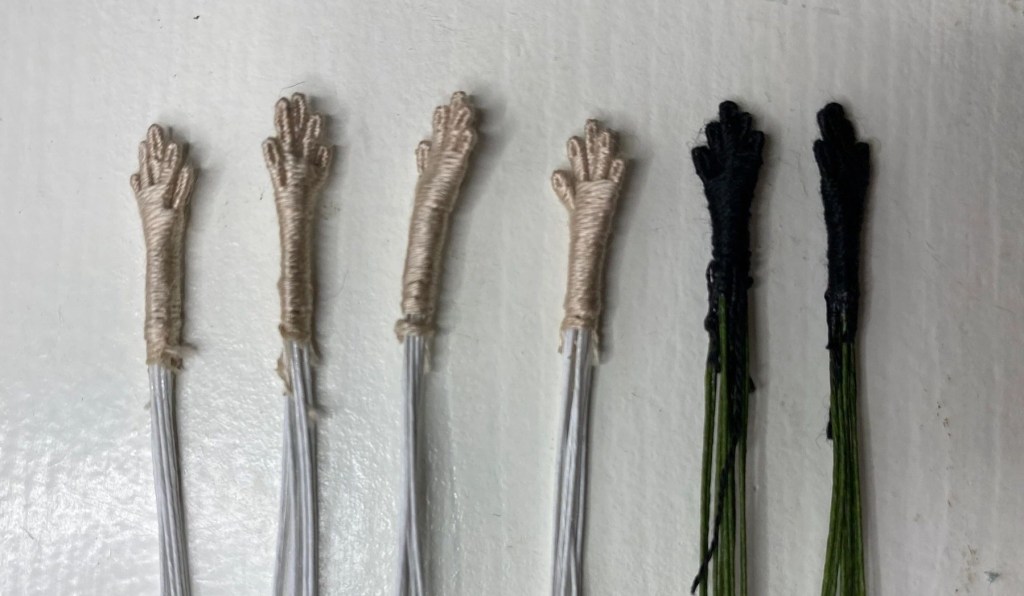
The OHP templates helped me a lot in placing the arms in the correct position, but the padding of them was quite difficult. They ended up looking more like body builders at one point rather the human figures! It therefore took a couple of go’s to get them right.
That is one of things I really enjoyed about this technique, and also about applique. You can sample and try more easily before committing and also you can end up using your sample on the actual piece if it is good enough straight away.
The leather is kid leather from the Golden Hinde. I had to thin it out because otherwise it was far to chunky for the figure. I used a small craft knife to scrap leather from the back to get a thinner piece.
The nubuck fabric for robin’s hood and boots was from a piece my aunt still had lying around, and which I died darker with the silk paint. Social media is so helpful for this too! She had reacted to my post, asking for sample pieces of a particular kind of fabric!
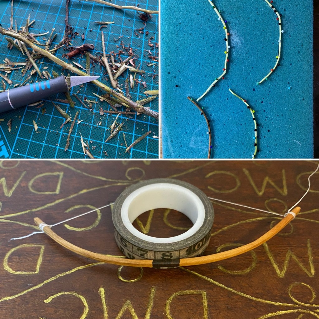
Robin’s arrows are pieces of paper covered wired which I painted. This is the same wire used for the hands. His bow is carved from a piece of witch hazel from my parent’s garden. The swords are carved from disposable wooden spoons I saved from my lunch at the Hampton Court Palace café. I tried making proper leather sheaths for them but they looked far to chunky and untidy so I ended up painting the wood in the appropriate colour instead.

The fabric for Robin’s arm and the faces is Liberty Tana Lawn cotton which I died using the silk paints to be less white. I added some extra colour using water coloured pencils.
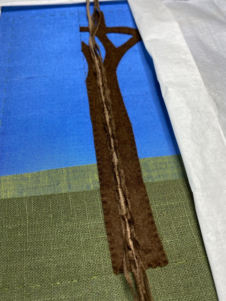
More Background and finishing
After I had finished the figures I added the big tree. The tree is made by couching different coloured chenille threads (from Devere Yarns) on a felt background. The other smaller trees are stitched using DMC stranded cotton.
I also added some stitches below their boots as shading. I debated about adding more elements but when I returned to class with my projects my tutors were very happy as it was and said I didn’t need to add anything more.
It came of the frame and I mounted it. It was quite difficult to get the fabric taut and as you can see there still is a ripple. This is because of the tree (and the many plunged ended at the back) and the plunged ended behind the figures. Even lacing didn’t help to get it completely taut.
Assessment
As you can guess I was completely ecstatic with the mark I got for my project: 95%!
The main comment was:
“This is a striking, traditional design that shows care and thought has gone into fabric and stitch selection. The stumpwork techniques of needlelace slips, figure padding and the creation of hands and faces has obviously been understood. The extra details of bows and arrows and swords work well scale wise and artistically well done.”
First impressions (40/40)
I received full marks for this. The assessors wrote: “Well presented, clean embroidery with good thread condition throughout, well done”
Design (75/73)
I lost two marks for this, as the darker green fabric wasn’t entirely on the grain.
The comments read “A well designed stumpwork embroidery with an appropriate use of fabrics, threads and stitch choices. Take care to ensure all fabrics remain on the grain across the piece. The darker green fabric travels up on the left hand side. All proportions have been maintained and are consistent with the source image.”
Slips (100/95)
“A good variety of textures have been used via both fabric, leather and needlelace to achieve the various elements of the design. The slips have been secured with invisible stitches. The needlelace slips have been neatly worked with an even tension but take care as the side edges are not as smooth as they could be. They are shaped appropriately for the design.”
I am not surprised I lost some marks for the edges of the needlelace. I did find it difficult to keep the edges neat as you have to attach and fasten off somewhere. I tried to keep it as neat as possible, but I suppose it will get better with practice.
Figure (head, face and hands) (85/79)
“The figures have been padded firmly and smoothly. However the back foot on the sheriff of Nottingham looks a little too turned out and the foot lacks an appropriate depth. The original image is taken looking up at the figure so the lower part of the foot is slightly obscured by the stone steps. This needed to be adapted a little for the perspective of the embroidery. The heads on both figures are smoothly padded with good positioning and appropriate contours. Although the left hand side of Robin Hood’s face is slightly rippled where it has been stitched. Both faces are very pale, perhaps some stubble on the Sheriffs face, as in the photograph would have been suitable. The hands and hair are both appropriately coloured and neatly worked and applied. Well done.”
Sir Guy would have been very impressed to be called the sheriff I am sure! I knew Sir Guy’s foot looked a bit odd when padded but I couldn’t figure out what I had done wrong. Of course, it was partly obscured by the steps! How stupid of me not seeing that… I must have been distracted. I also lost some marks for the rippling and the colour of their faces. I totally agree. I was just to scared they would ended up looking like clowns with more colour!
Mounting (35/32)
“The board has been cut accurately and the design is placed straight on the board with the grain of the fabric running along the edges, except on the lower left hand side, already noted, where it was applied slightly off the grain. The silk fabric still has movement in it and needed to be pulled a little more firmly. An attempt has been made to remove the pinpricks but there are still some visible. On the reverse the calico corners are neatly worked but one of the linen corners is a little open and needs more stitches and the other has a gathered appearance rather than mitred. The backing fabric is neatly applied and the slip stitches invisibly worked and consistent in size, well done.”
I never managed to get full marks for mounting. I think it is an impossibility. There is just so much to go wrong. I had already mentioned the difficulty in getting the fabric taut so of course I had to lose marks there too. On the plus side, for the first time ever I got full marks for the backing fabric!
Conclusion
I know this post was gravely overdue as it was completed two years ago! I just haven’t had the opportunity to sit down and do a proper post. I didn’t want to do a quick post as I wanted to include as much as I could if you are considering to do this module as well or create a stumpwork piece of your own. I hope you have found this post helpful. There are plenty more WIP pictures in my Instagram and Facebook posts and there is also a stories highlight on Instagram. Let me know in the comments what you think and I aim to get a post on my creative box and advance goldwork out soon too!


these blog posts are so helpful!
LikeLike
Thank you so much! So glad to hear you find my posts so helpful!
LikeLike
I did very much enjoy following this project, and I think it turned out splendidly! You’ve made such good use of the different textures and materials.
LikeLiked by 1 person
Thank you so much Rachel! So glad to hear you have enjoyed following my project.
LikeLike