
Inspiration
I first became familiar with the Observer’s books a couple of years ago. Since I didn’t grow up in the UK – I am from the Netherlands – I never ‘grew’ up with them. I initially became attracted to the design of the covers underneath the flaps and the different colours they were made in. Once I picked up a copy of my first observer books, Churches, Glass, Furniture and Pottery and Porcelain I became instantly hooked on the contents too. The first titles I purchased were very much inspired by my profession (I am an archeologist and heritage adviser) and my interest in antiques and vintage.

My collection quickly grew, and I started to discover the different editions and look for items in good condition which would display even better. That is also why I have become a member of the Observer’s books society to learn more about my collection and try and expand it. Also, the Observer’s look book by Phil Sowry has been an invaluable source of information for me.
Design
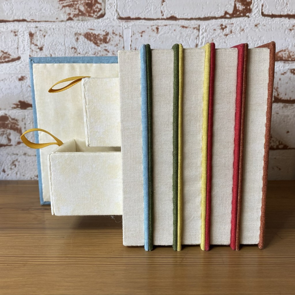
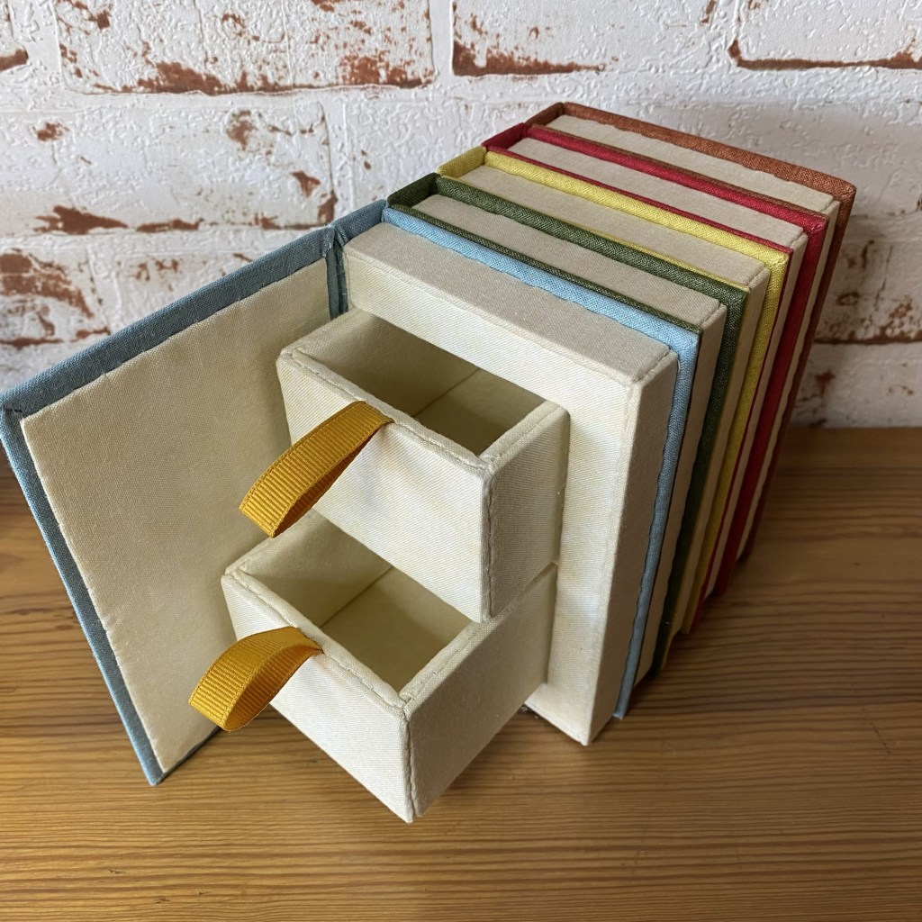
I thought it would be a nice idea to create a box which would disappear in its surroundings rather than create a display piece. We have all seen examples of books which had a hole cut into the pages as a secret hiding place for a bottle of alcohol, weapon or something else which should remain hidden. By creating a little row of Observer’s books, I could create my own secret storage that would sit nicely within my collection.
I had originally intended to make a couple of single books which would sit spread out within the rainbow of book covers. However, I quickly found out that it would be near impossible to create boxes from single books. Due to the construction of embroidered boxes there would have hardly been any space inside which could contained something. It was therefore quickly decided to create a row of books instead, with storage that would go through the whole row.
The first challenge was to pick the colours I would use for my books. The Observer’s books are published in a wide array of colours, some of which have faded over the years adding to the shades available. I picked up a large collection of suitable colours for the covers from Creative Quilting (near Hampton Court Palace. The fabric is from the Linen texture range by Makeower. It comes in lots of different colours. I also picked a cream in the same fabric for the face of the pages. I wanted something linear to represent the pages but anything I found was not in the right scale of my tiny books. Finally I picked up a mottled cream fabric which would serve as the inside of the books as it looked similar to discoloured paper.
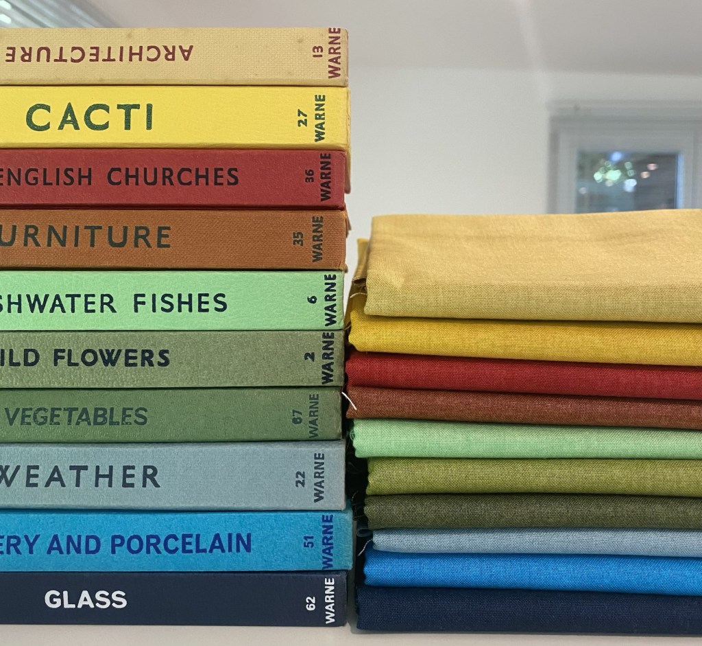
I came up with four different sets of five fabric and I posted a poll on Instagram to help me decide. The poll was as indecisive as I was. It only ruled out one option but the other three received a similar number of votes each. After a while I made the decision to go for the group I chose because those colours are the colours which appear most often in the Observer’s book range.
Even though there a hundred different titles, I wanted to create my own set of Observer’s books about topics which have special meaning to me and which don’t exist as actual titles yet.
At the bottom of the spine the Observer’s books all have numbers, denoting the number in the series. As my book titles are new, I added my own numbers too, to give the illusion of the series continuing. I thought of numbers which have a special meaning to me to or which are appropriate for the theme of the book.
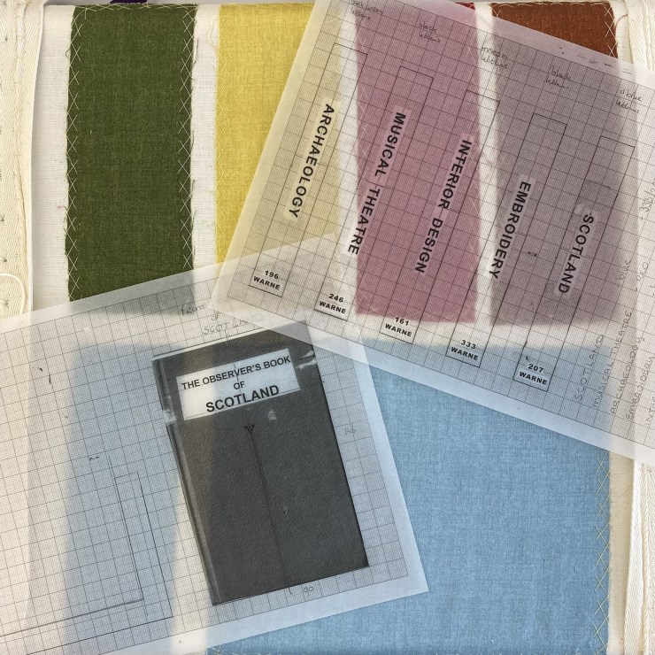
In order to create the pattern for the embroidery I thought I would mix the letters of the existing books to create the words I needed. I quickly discovered that all books have a similar but slightly different font (in size and in thickness) so I couldn’t copy letters that way. I went onto my computer and found a font which resembled the original font. I changed the spacing and the thickness to create the closest likeness. I changed the spacing and the thickness to create the closest likeness. I printed the words out and glued them to the cover templates I had drawn on graph paper. This enabled me to get the text in the correct position. On the original books the numbers at the bottom of the spine are never placed at the same height on the spine and so that quickly became the only place I could really create any variety in the books which make up the box as I had to keep the height, thickness and typeface of the books the same. When you see the books on a shelf it is this feature which still creates the illusion of five different books rather than a perfect block which stands out.
I then photocopied the pattern on tracing paper so I could use it with a lightbox to transfer the text onto the fabric. For the colours of the lettering I picked those which were normally used on the books apart from the colour black. The stitching is done in a single strand of DMC stranded cotton and for the smaller lettering in a single sewing thread.
Construction
The small size of the books actually proved to be the greatest challenge. When looking at the books in detail I quickly discovered that they aren’t all exactly the same height and definitely all have different thicknesses (due to the difference in length of the contents). However, making replicas of the tallest book with the greatest thickness was really the only option as for smaller thinner books the boards would have been too small to cover properly.
One of my tutors helped me to think up the way in which the box could be constructed and how the means of construction would help it look like the original books. For instance, as with the original books, the mitred corners on the covers can be seen, whereas I could have chosen to hide them on the side that isn’t seen.

Normally you would start making up an embroidered box from the inside out. This is to be able to account for the box growing as you work due to card (which you can measure) being covered in fabric (the thickness which you can’t measure). However, because the books had to be the correct size on the outside, otherwise they would have not resembled the actual books, I had to work from the outside in. I created all five books separately before stitching them together and adding the internal structure which would hold the drawers. Next, I added the back of the brown book.


After stitching all of the lettering on the spines and front cover, those boards were covered and attached to the box. This was quite a challenge as even though the fabric is quite thin in itself a number of layers of fabric does amount to quite a bit. Especially when stitching on the spines and the moving front cover, I had to be flexible in my approach to adapt the design and added a magnetic closure. Finally, I made the drawers to slot into the box. They are quite stiff, but I think that is also partly true to the fabric rubbing against each other. I feared making them even slightly smaller would run the risk of gaps showing which is something I definitely didn’t want.


Assessment
Unfortunately I didn’t received as high a mark as I had received for my previous modules. I received 74%, which is still a pass! I have written down the comments of the accessors so you can see how the creative box module is scored. There are only three sections, which is far less than any of the other modules, which means losing marks in any of them is going to have a much greater effect. I knew that when I handed them in that the box wasn’t perfect but I felt that this was the best I could achieve with this difficult design. Most importantly I do love them. A picture of the box is actually the screensaver on my phone, so I look at it every single day!
The assessors overall comments were:
“This is a beautiful concept that clearly means a lot to you and will set well with the rest of your collection. Box construction is a fiddly technique that needs precision and planning, maybe with your next box a more comprehensive mock up will help eliminate the issue had with the drawers.”
I did find it difficult to make a proper mock up just out of cardboard. Without the fabric covering the sizing is off (as the fabric still adds about a millimetre). I also found it difficult to envisage how it would all fit together and whether no rough edges would be showing etc. without actually stitching the thing.
First impressions
For this section I received 44 out of 50.
” The exterior of the box is well presented but unfortunately the interior of the drawers show a number of alien fibres. Take care with design marks on light fabrics as a number of outlines can be seen on the yellow spine. Some of the spine embroidery also appears a little crushed and worn. There are no dirty marks visible and starting and finishing stitches have been hidden.”
To be honest, I hadn’t spotted the design lines showing through. I had purposefully picked a flat stitch to prevent damage to the embroidery and to resemble the embossed lettering of the actual books. Due to handling and stitching the box together, it must have still cause some damage even though I was super careful.
Design
For this section I received 59 out of 65.
“This is a good choice of design for box making. The embroidery worked for the lettering is inconsistent in size in places and it would have been nice to see some embroidery to denote the pages of the books as this area is very flat and when viewing from the opposite side it does not read as books. The fabric choice is suitable with attractive colours chosen.”
I had considered embroidering some thin lines on the book block to denote its pages. However, due to the small scale I thought it ended up too messy and busy. I like the clean lines and the back of the box won’t be seen that often.
Construction
For this section I received a score of 81 out of 135.
” This is a complex box to try and recreate with many different sections that need to work harmoniously together. Unfortunately the piece does not always appear to have been accurately cut and at times this has been exaggerated with the construction. The sides and base are a little uneven in construction and sadly the moving elements have not been successful. The drawers need to be much looser, we should not risk damaging the construction by opening these elements. If you were worried about the drawers sliding out, using a magnet at the back of the drawers to secure them to the back of the box would have been a safer option. The front cover would have fitted more comfortably and neater had the internal section be lower and an additional internal lid panel been used. Some areas of slip stitching are well sized and securely stitched however many visible stitches can be seen throughout, especially on the hinge which is coming undone and there is an internal section on the lower drawer which is also loose. Unfortunately many of the panels have not been covered tightly by the fabric and there are large ripples inside the drawers and throughout the pages of the books. The fabric grain is also off across the piece. When wrapping fabric around corners, take care not to create bulky joins and try to avoid raw edges that then need gluing to secure them. A larger inset panel on the front cover would have hidden the mitres more successfully. Some of the external parts of the drawer and the front and back cover of the books have been covered with well tensioned fabric.”
Next time I will definitely pick a box shape with wider pieces. It was very difficult to cover something neatly which is only 2 cm wide. I had totally underestimated how difficult that would be. Keeping it on the grain and taut was a nightmare. My tutors and I had considered various options for the lid, including an internal lid. However, we both decided that would cause other problems and end up being worse than the option chosen. When writing my self evaluation I never thought to put that in. Lesson definitely learned to put absolutely everything in my self evaluation form! (spoiler alert I did forget something again for my goldwork piece). The drawers were very difficult to achieve. I actually made a few. I knew they were tight but able to move. Also I had never tried to open drawers on a successfully completed box before so I didn’t know how smooth they could run. I didn’t think there would be much between tight and too loose because of the fabric layers rubbing against each other, but apparently there is!
Conclusion
Even though it was a big challenge, I am really happy with how my books have turned out. I had hoped for a mark to be more in line with other marks I had received for previous projects, but the difficulty of this project meant there was a lot of room for error, which was picked up on in a few instances. I am still very happy with them though and they stand proudly on the shelf with my other Observer’s books.

However, they will go on a little journey soon as they will be travelling back to the UK with me in October as they will feature on the RSN’s stand at the Knitting & Stitching shows at Alexandra Palace (10 -13 October 2024) and Harrogate ( 21 – 24 November 2024)! They will be the first project to be exhibited. So if you like to see my little row of books in the flesh, you can! Head over to the RSN stand and see it and all of the other beautiful work by RSN students.
Moreover, my little books will also feature in an upcoming edition of the Observer’s Book society magazine! Collectors of these adorable little books can all see and read about how I have recreated them in stitch.

I think you were right not to add lines for the pages. I can see that the assessor would think of it, but I think they didn’t take into account how much more personality stitched lines have than drawn lines!
So the takeaway from this is to put everything, including what you didn’t do, in the the self-assessment, so they know that you’ve thought about it!
LikeLiked by 1 person
I know! That is definitely the big takeaway from this. I have tried to put it into practice for my advanced goldwork, but again forget something that they picked up upon. It is surprisingly difficult to remember or write down at the time all of the things you (however briefly) considered and decided against! It is much easier to write what you did do!
LikeLiked by 1 person
That’s actually one of the things I use my blog for, even though I’m not being assessed, but just because it gives me a record which is useful when I come back to a project after time away.
LikeLiked by 1 person
That is a really good idea! It used to work a bit like that for me, I just don’t have the time to keep up with my blog as much as I like. Would love to do more posts and add even more detail. I do try and give practical info like threads, fabrics and stitches used. For my own benefit as well as for others who might see something they like. Knowing how many decisions I had to make for the more creative modules I think they would have been some extremely long posts if I had included all those!
LikeLiked by 1 person